

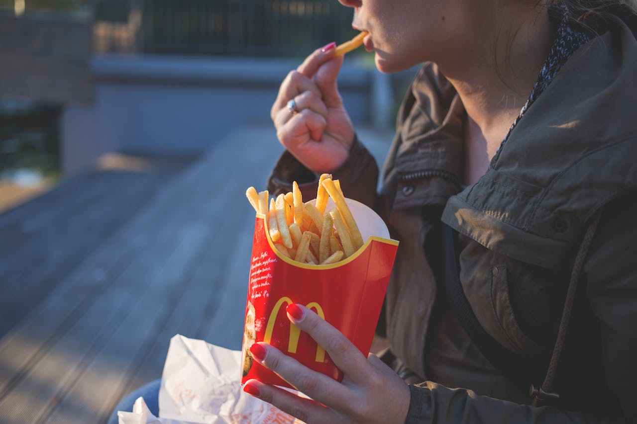
What do McDonald’s, KFC, Pizza Hut, Burger King, Wendy’s, Domino’s, and Chick-fil-A all have in common? They’re all fast-food chains, hugely popular across the US, offer an abundance of meat options, and their logos all feature red in some way, shape, or form. That last part is not a coincidence.
Research suggests that color has a big impact on our purchasing decisions, especially when it comes to what we want to put in our mouths. Red is associated with excitement, warmth, and passion. It stands out, draws the eye, and grabs our attention. In a busy mall, you can identify a fast-food chain quickly, largely because of the industry’s association with red.
 Pexels
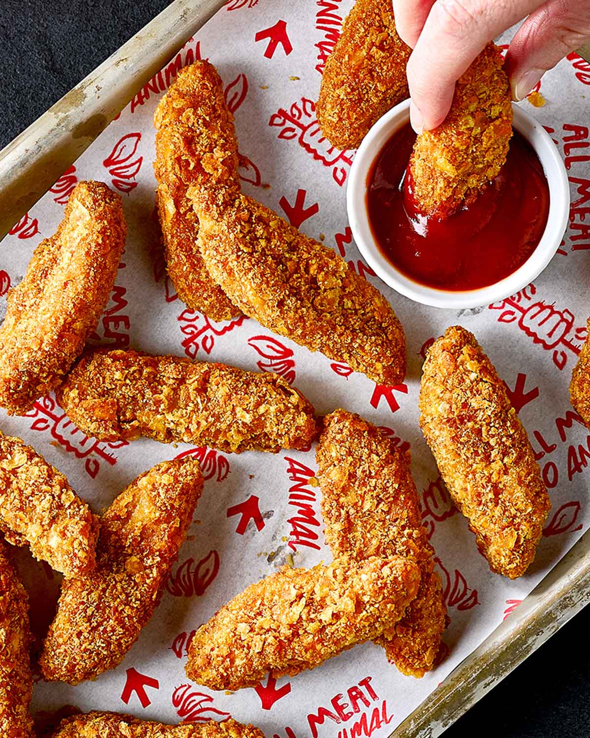
This has also helped us associate the color with processed meat. After all, while some of their vegan options are slowly increasing, that is what most of the above chains offer. What red usually doesn’t signal to consumers is plant-based, healthy food—that is usually the job of green. One recent study from ProVeg International confirms this.
The research noted that around 75 percent of Brits see green packaging and think healthiness, while 78 percent think eco-friendliness. In the US, the stats are similar—68 percent of Americans link green with naturalness and eco-friendliness. The study also found that green is strongly associated with plant-based meat by 72 percent and 68 percent of Brits and Americans, respectively.
It’s no surprise that consumers feel this way. For many, the big appeal of plant-based products is often their sustainability credentials and their nutritional value. But they also often taste great, too. And if vegan brands want more consumers to find this out for themselves by giving their products a try, they might have to start considering a different color palette, research suggests.
 VFC
VFC
To attract consumers to plant-based products, go red, say experts
ProVeg International’s study found that red was seen as the tastiest color by more than half of consumers in the US and the UK. “Use red in your packaging to highlight the taste of your plant-based products,” the ProVeg report advises brands. “Especially when targeting flexitarian and omnivores, who may not immediately gravitate towards products dominated by the color green.”
“By breaking away from the green tones that are so prevalent in plant-based products, you can effectively distinguish your offerings from those of your competitors,” it continues.
This shift in branding is welcomed by Jennifer Stojkovic, the founder of the Vegan Women Summit, a global events and media organization dedicated to nurturing the growth of women-led plant-based businesses. “My personal view is that the [consumer packaged goods] space has way too much ‘me too’ branding. If I go to a Sprouts Farmers Market or Erewhon right now, all I see is a sea of the same,” Stojkovic wrote on LinkedIn.
“When it comes to plant-based products, in particular, it seems obvious that red is a standout color, considering how many competing packages are green,” she continued. “If you are trying to give off a sense of ‘health’, green may be the way to go, but if you are going for taste, the science shows that red is the best way.”
 VFC
VFC
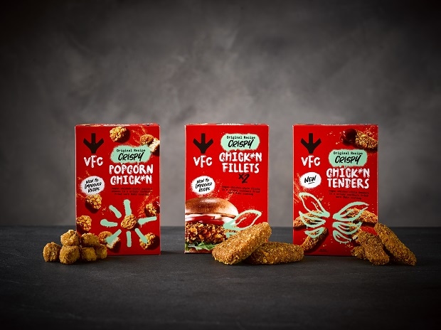
Some brands are already embracing red. Vegan chicken brand VFC is a great example, as red is the main color of its packaging. The company often cleverly mixes this with green in its branding, helping to subconsciously communicate to consumers that while this product is plant-based, it’s not a boring health food either.
 Impossible Foods
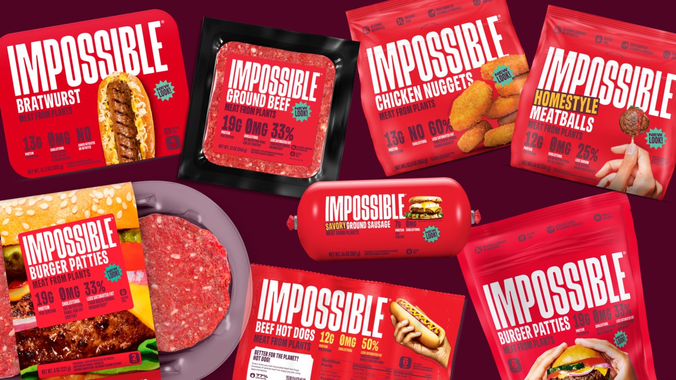
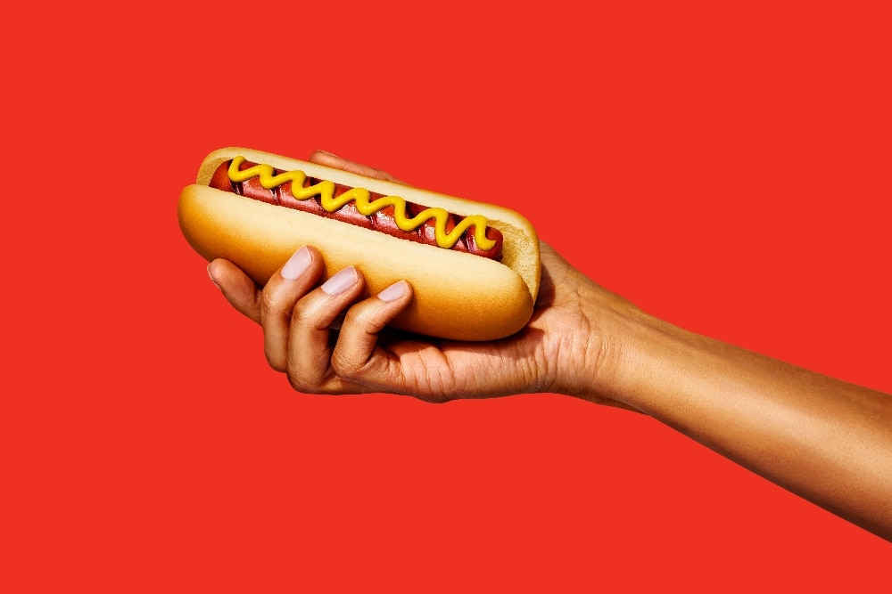
Impossible Foods, one of the leading plant-based meat brands in the US, has also got the red packaging memo. Today at Natural Products Expo West, the brand debuted a new bold red aesthetic, which will be seen for the first time in the packaging for its new Impossible Beef Hot Dogs. The reason behind the move is simple: it wants to capture a wider consumer base.
“We’re the fastest-growing plant-based company in America, so it’s a good time to evolve from a position of strength. We wanted packaging that lived up to and reflected the deliciousness of our products while really popping on the shelf,” Peter McGuinness, president and CEO of Impossible Foods, said in a statement.
 Impossible Foods
Capturing meat-eating consumers is vital
Impossible Foods has long been focused on convincing more meat-eaters to try its product. From the start, it has positioned its products as for meat-eaters, rather than just vegans. Its burgers, nuggets, sausages, and more have been formulated to be as meaty as possible. And just like its rival Beyond Meat, its burgers even give a realistic “bleed” when you bite down into them.
The aim is to give consumers a delicious product, of course, but like all plant-based meat companies, it also has an ulterior motive: to help transition the food system away from meat. The livestock industry is detrimental to the planet—it is both the leading driver of methane emissions and destructive deforestation.
Meaty plant-based products represent a more ethical, more sustainable solution, but to transform the food system, more people have to buy the products. The future is already looking bright, with the plant-based food market set to exceed $162 billion by 2030, but Impossible Foods is hoping with a little help from the color red, it can move the needle even quicker.
“We’re not just growing a brand, we’re growing an entire category,” says Impossible’s Foods’ chief marketing and creative officer Leslie Sims. “For a long time, meat eaters didn’t see us as something for them. But our mission relies on attracting meat eaters, so we wanted to do what we could to be more inviting in our approach and messaging. We’re confident that once they try us, they’ll be in.”
For more on plant-based meat, read:
JUMP TO ... Latest News | Recipes | Guides | Health | Shop

Charlotte is a writer and editor based in sunny Southsea on England's southern coast.


